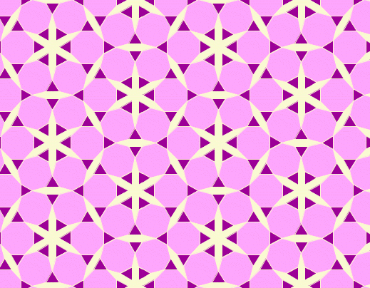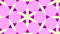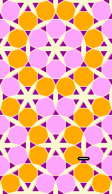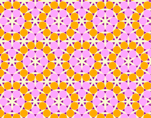
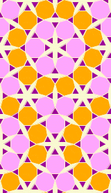
 After a big battle with aesthetics, I finally settled on this pattern that makes a nice wall paper background (the image on the right). I'll highlight some of the battle. I originally started with a two colour pattern with just pink and purple. I thought it would have more impact than it did but I think with the regularity of the colouring that the pattern was dull. I added some colour it to make its bigger loops of twelve octagons and twelve triangles stand out. Even after I added orange to the mix it seemed too regular. The I introduced a twist to the pink loops of six octagons. To show you these transitions I'll added the pictures below. The key to recognizing the differences is to examine the negative space especially the asterisk like shapes. Notice there are two orientations in the pattern above as opposed to below where there is only one.